|
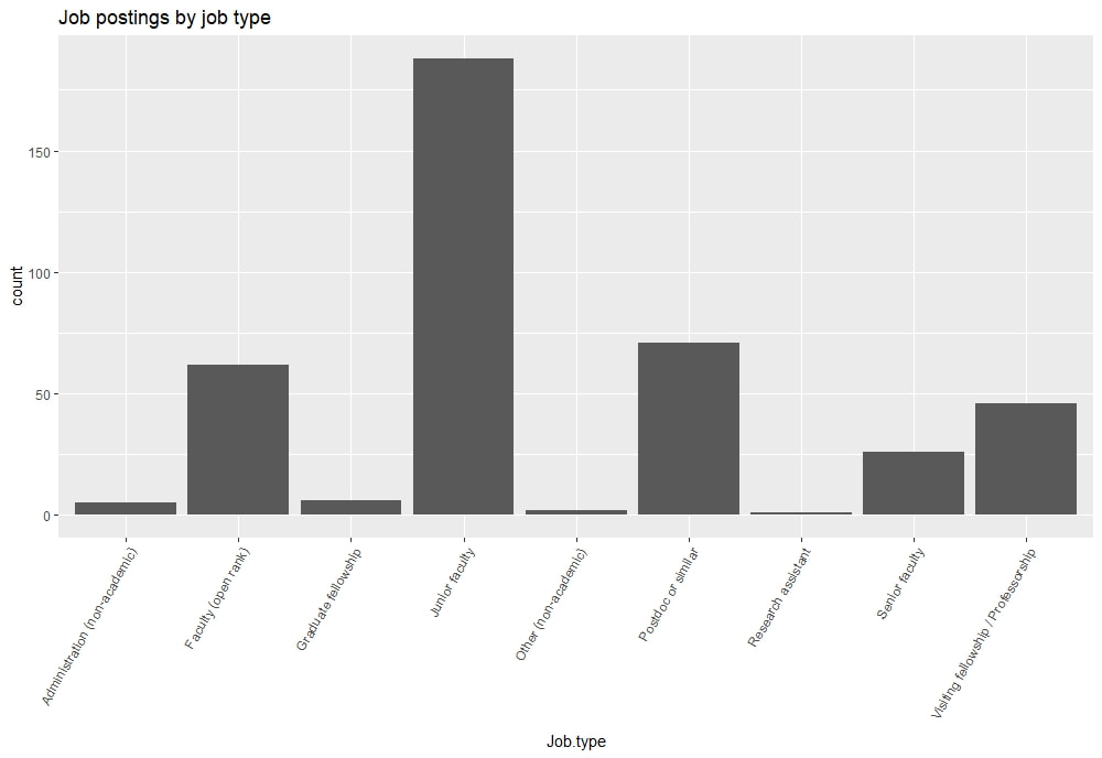
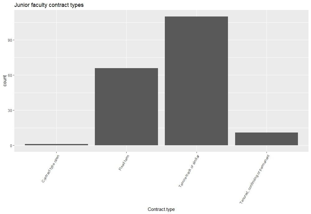
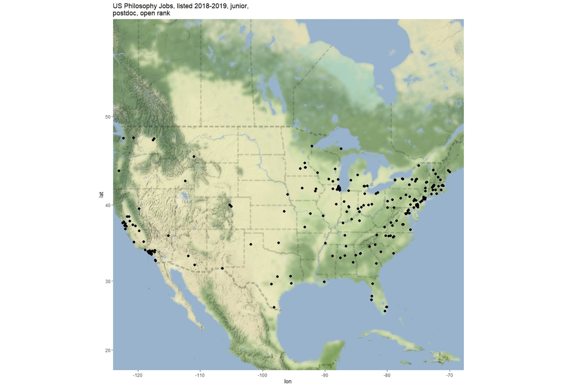
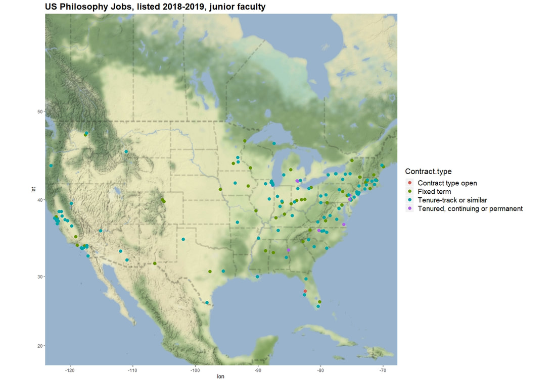
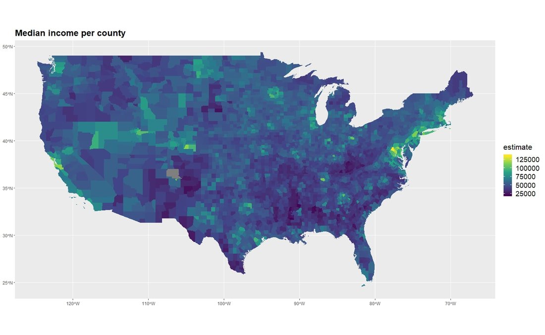
I recently downloaded some data from PhilJobs on job openings in the past few years. I wanted to share some findings from that dataset: some where's and when's. The data has a number of variables of interest: hiring school, kind of job (academic or not), date the ad was posted, date apps are due, level of job (postdoc, junior, etc) and contract type (TT, fixed-term, etc), among others. With these data, we can ask some interesting questions. Here's what we're looking at today. 1. how many jobs were there? 2. where were the jobs? like literally, where in the world were the jobs? I filtered the data for three kinds of job: junior faculty, postdoc and open rank hires. (FWIW filtering for "junior" doesn't discriminate between TT and fixed-term. We'll have a chance to separate out TT and fixed-term later.) We might look at admin jobs or senior hires, but I'm not terribly concerned about those groups, tbh. When reflecting on how terrible the job market is for philosophers, the usual victim is a newly-minted (or newishly-minted) PhD looking for steady employment. And as far as the boundaries of the hiring cycle, I used August 1 to July 31 to define 'hiring cycle'. As we'll see, jobs are posted year-round, but these bounds feel natural for identifying the beginning and the end of a cycle. But before we completely leave the non-junior jobs behind, let's look quickly at the number of jobs posted last year in each category. So during the 2018-2019 hiring cycle, there were roughly 180 junior jobs, 70-ish postdocs, and 60-ish open-rank. Let's zoom in on the junior faculty So 110 or so jobs are TT and 65 or so are fixed-term. 10-ish are junior but "tenured, continuing, or permanent." I imagine this is a catch-all category for "junior faculty, long-term" Now, let's look at where the jobs are. I used the ggmap package. Word to the wise: this package is awesome, but make sure you (i) get your google apps key and (ii) enable the static maps API. (Details are in the documentation for ggmap.) It took me forever to figure out that I didn't tell Google that I wanted to use the static maps. Anywho, we'll start with postdocs, junior faculty, and open rank and then focus on junior positions. So here's something interesting: most jobs are on the east coast -- particularly the northeast corridor -- or California. No jobs in the Dakotas, Utah, Wyoming, or New Mexico. Now let's look at junior faculty jobs, and we'll color the dots by contract type. There's no clear pattern to TT vs fixed-term jobs in terms of location. CA had a bunch of TT jobs. So did the northeast. What's the takeaway? There's a big divide in the density of job openings east and west of the Mississippi River. Once you move west of those states whose eastern borders are the Mississippi, jobs are a lot scarcer. Beyond that, there are higher concentrations of jobs in (1) California and (2) the northeast (NJ, NY, CT, MA...and also some bordering states like PA, VA, and MD). If you get your PhD on the east coast or CA, you have a decent chance of staying there. So I says to myself I says, "I wonder how this compares with median household income per county..." Here's the map: Hmmm.... nothing obvious. The northeast and Midatlantic regions have a higher median income per family than lots of other places in the country. (Holy shit -- Northern Virginia has a median income of $125k! That's higher than the Bay Area! And I'm astonished because I grew up the son of a handyman in NoVa.) More detailed investigations might yield something, but now it doesn't look like much.
0 Comments
Leave a Reply. |
About me
I do mind and epistemology and have an irrational interest in data analysis and agent-based modeling. Old
|

 RSS Feed
